Monday, April 16, 2007

Assignment 10 - Newspaper.Design

Cover:
Double Page Spread:


Influences:

I liked the way the magazine “Straight” set up their cover for a couple of reasons. They integrated their front cover image well into other design aspects of the cover like the main title head or other graphics. They also use a dotted line with a plus sign on the end to connect or divide articles. I really liked this characteristic but decided to change it up a bit. I used circles to connect the end of the sentence with where the article was located, also doubling as a period. The Charlatan had a cube design I wanted to adopt. They used it to feature other articles in the issue, but I wanted to create cubes to run down the side of the cover, using them to frame the page numbers of article, and also to bring the design together as a whole. I found this assignment to be a challenge considering type is one of my weaker aspects of design; color and graphics being my stronger points. I really tried to push myself and see what I was capable of, and overall was impressed with what I came out with. Thanks for the great year Michael!




Monday, April 2, 2007

Goth Subculture


It all started in the United Kingdom around the mid 1980's, mainly revolving around the gothic rock scene, an offspring of the post-punk genre. Mainly identified by dress, it has spawned into many different types of "Goth", and varies from country to country. The type of music is also very identifiable, along with their so called style. Many attribute it to old gothic literature and through horror movies.

If you see heavy makeup... with chains, piercing and black attire, you can usually come to the conclusion that they are goth.

Wednesday, March 28, 2007

Assignment #9: Architectural Deconstruction

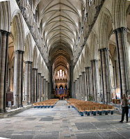
Salisbury Cathedral
Final Project:
Source Photos:

When I first read the description of this assignment I got really excited, instantly the images of old castles, cathedrals and churches came to mind. I had to figure out a way to showcase the amazing architecture of these ancient gems. I started playing around with things like blueprints and wireframes along with original pictures. I made a 3D model of the arches, I then deconstructed them to the wireframe model and then blended those with a set of blueprints to create a well rounded abstract portrayal of the Cathedral. I also tried to make the arches look more weathered and frail, using a warming effect and over sharpening the edges for a more jagged look. I am very pleased with the finished product and have a new appreciation for this type of architecture.

Saturday, March 10, 2007

Assignment #7: Visual Onomatopoeia or Logos

Version 2

So my first attempt didn’t cut it, so I went back to my design and made some refinements. First of all I took away the stems at the bottom of all the leafs, which framed the snowboarder more effectively; I also removed the bottom leaf. I then removed the drop shadow from behind the logo, and font. I then switched up the font and moved it to the base of the logo, putting it on a slight curve that compliments the overall shape. I am much more pleased with my new design which speaks to the dominant youth client base for Canada Olympic Park.

Version 1:

Tuesday, February 27, 2007

Assignment #6 - The Character of Type


I found this assignment to be interesting and fun. It opened my mind about text in general and I now look at each font in a different way; mainly what it would represent visually and what imagery it would bring to mind or be associated with.

Tuesday, February 6, 2007

Assignment #5 - Your True Colors


I found this assignment at first to be challenging, but in the end I had a lot of fun with it. I never looked at color the way this assignment made you; it really got the creative juices flowing. I got a feel for which colors went with which, and ideas for nice accenting colors for the future.